Overview
I joined Third Factor as the founding designer, early on, when the team was still figuring out what the brand and the product should be.
I shipped the SDK interface, now used by over 3 million Nepalis, ideated the entire brand and creative direction, and did some motion design on the side.
The first part of this is mostly visual. If you're here for the product, skip to the SDK interface.
01Brand and creative direction
Third Factor helps people prove who they are online. When I joined, there was a mission and a name, but nothing yet to carry it visually.
I ideated the entire brand and creative direction: the logo, type, colour, the visual language and how it all moves. The idea came from the product itself. On a screen we see ourselves as dots of light, and a computer sees us as 0s and 1s. Identity sits somewhere in between.
Moodboard
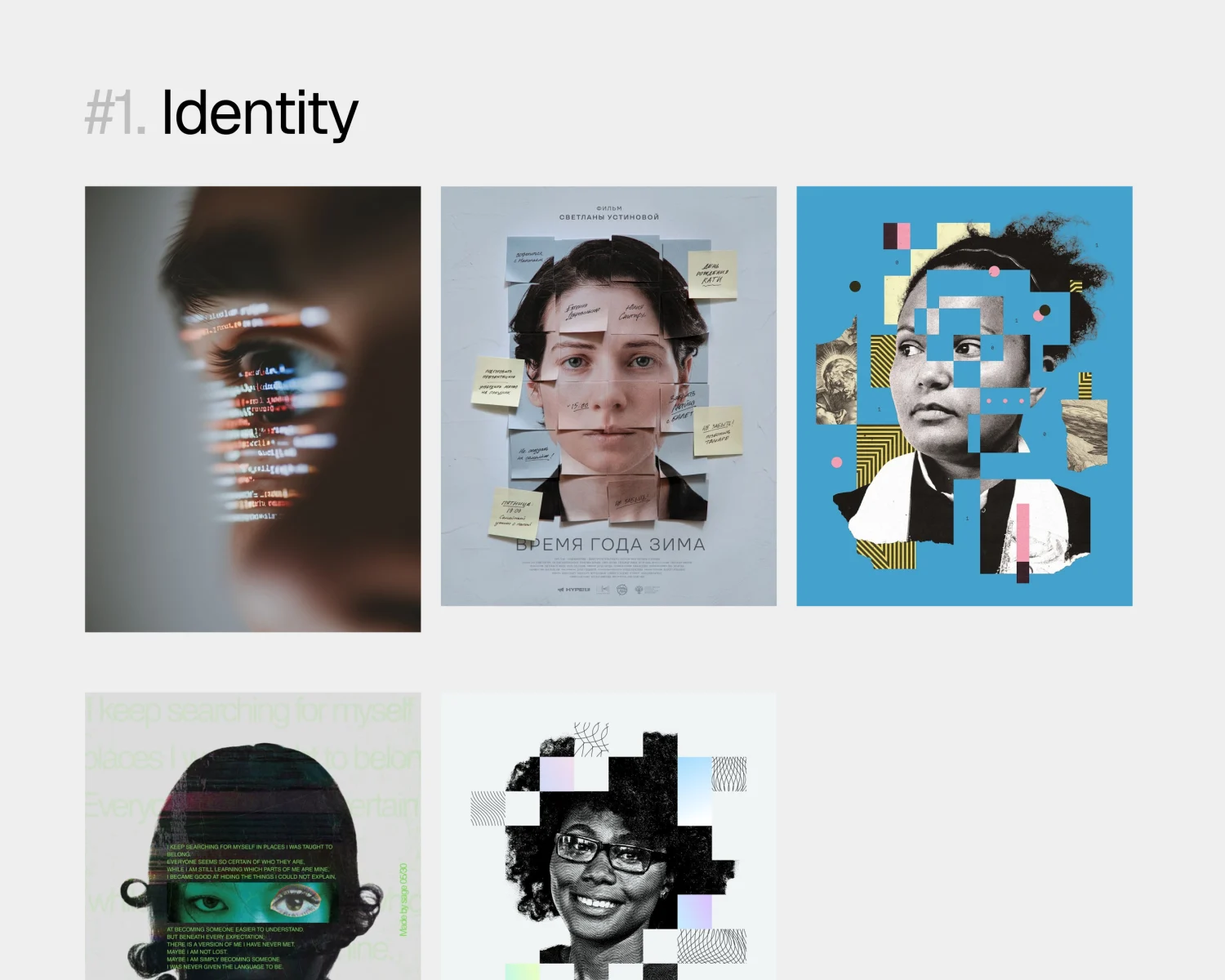
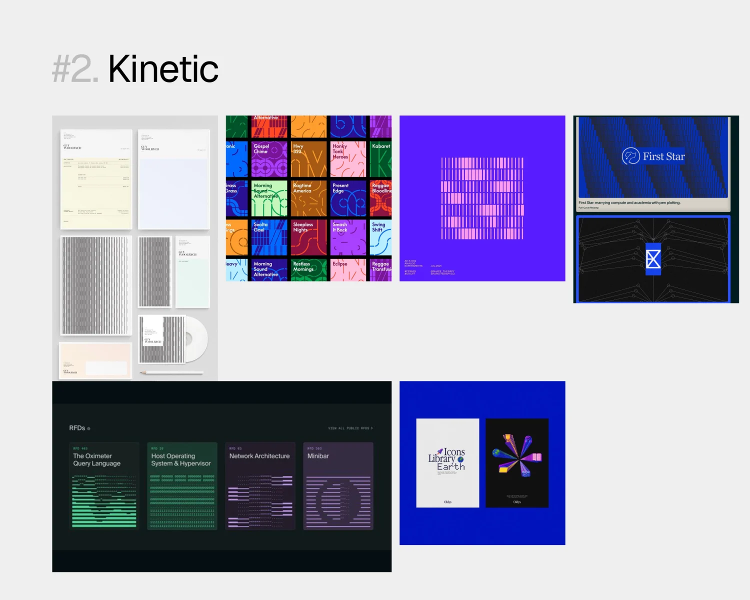
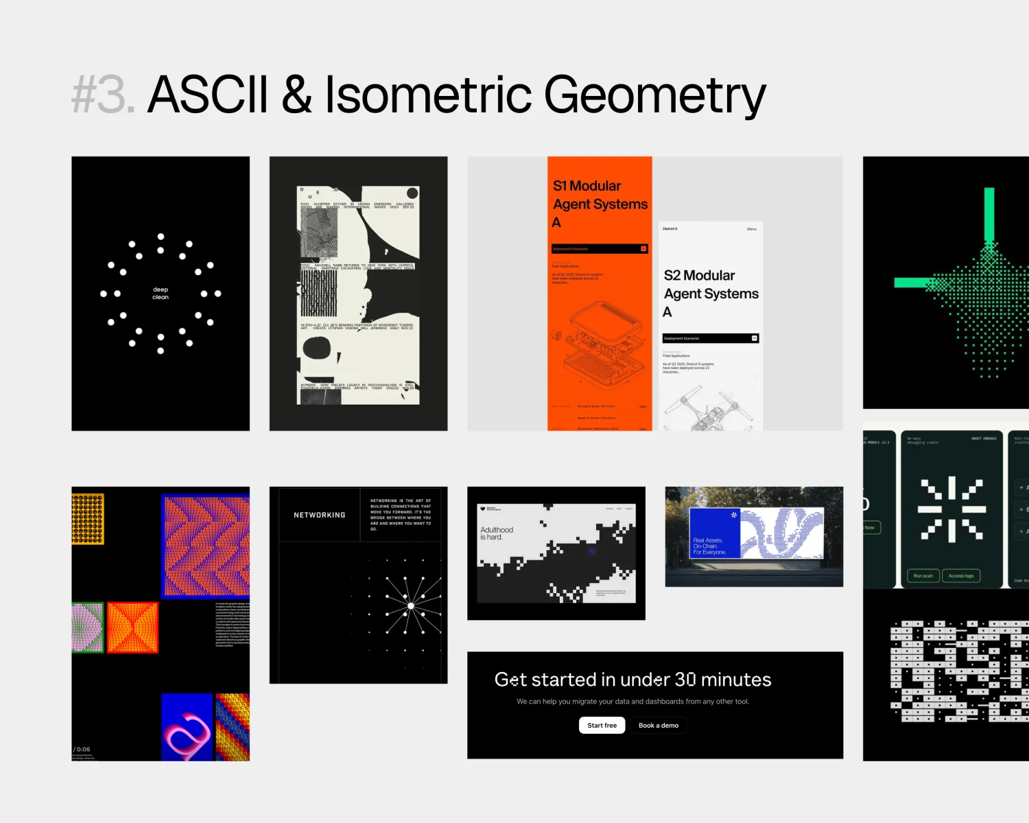
Before drawing anything, I collected references into three boards, each one a direction the brand could lean into: identity, kinetic type, and ASCII with isometric geometry. They gave the team something concrete to react to, and made it easier to agree on a feel before we argued about logos.
Exploration
From the moodboards, I started building the brand out of dots: icons for identity and trust, drawn on a grid so they could move and turn into one another. Alongside them, an isometric series pictured identity as layers.
Brand guidelines
Once the direction settled, I put it all into a brand guideline, so anyone on the team could use the brand without needing me in the room.
02SDK interface
The SDK is the verification flow other apps drop in: ID photo, selfie, liveness check. It shipped with Nepali banks and the Pension Management Office, and over 3 million people have verified with it.
I owned it end to end: the flow, every screen, every error and every line of copy, in English and Nepali.
What it had to be
People meet it while a bank asks for their passport and their face. A failed check means no account. Three rules:
- Calm: say what's coming, ask for little.
- Clear: always show what's happening.
- Forgiving: every mistake has a way forward.
Try it
Tap through it. Switch to Nepali from the language pill. Swipe from the left edge to go back.
Interactive prototype, rebuilt from my designs
Where it started
- The steps list said face verification twice.
- The confirm screen asked you to approve a photo it didn't show.
- The footer had three different names.
- The progress bar didn't match the steps.
- Some errors had no way forward.
Mapping the flow
I mapped every step and every way out before redesigning screens. The errors needed as much design as the happy path.
Decisions
Each one cuts a step, removes a doubt or gives a mistake a way forward. Here they are, playing on the prototype.
Three steps and a time estimate up front,so nobody starts what they can't finish.
Camera access is asked on the camera itself,with its title on screen saying why.
Country comes from your phone's region.Number and nationality are read from the photo.
Corners turn green once the page is found,and it captures by itself, no sheet in the way.
The ring around your faceis the progress bar.
A 3, 2, 1 over your live view,then a ring fills while you hold the gesture.
Missed the photo? Its field shakesand says what it needs, right there.
Each photo is checked the moment it's taken,so a blurry one is retaken on the spot.
A failed face match showshow many tries are left.
When it's done, it hands youback to the app on its own.
It moves like iOS: screens push, you swipe back.Nothing takes longer than a third of a second.
Written, not translated:तपाईं, everyday verbs, Devanagari numbers.
Outcome
It shipped, and it's in daily use: Nepali banks and the Pension Management Office run it, and over 3 million Nepalis have verified their identity with it.
- One flow for passports, driving licences and citizenship certificates.
- Every error ends in a next step: retake, choose another photo, or try again.
- Nepali written for the screen, not translated, so people verify in their own language.
03Reflection
I used to think design was an independent function in an org, and I leaned a little more into form than function. Working here changed that. Form should follow function, and real design comes from product clarity and solving for business outcomes.
04Bonus: motion
On the side, I made motion pieces for launches and campaigns, including the PMO (Pension Management Office) signing.